AMC Networks Landing Pages
My goal with this project was to build a layout that was reusable, was content forward, had good price expression, and a contant buy flow entry on screen.


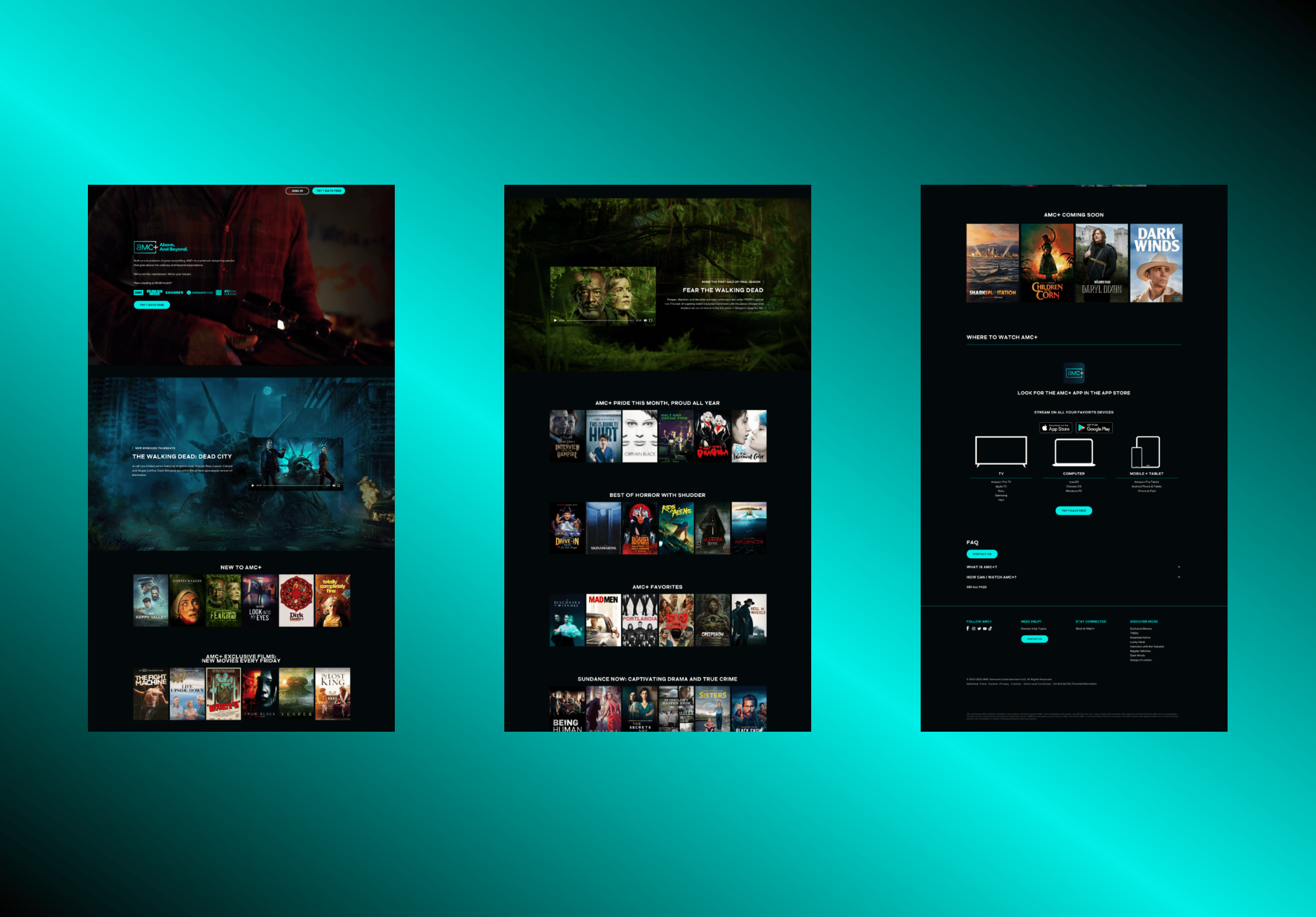
Before
The previous AMC Plus site had several key issues. It was too focused on specific content, failing to showcase the full range of what’s available on the platform. Pricing information was completely missing, the dark design felt uninviting, and there were significant accessibility problems.
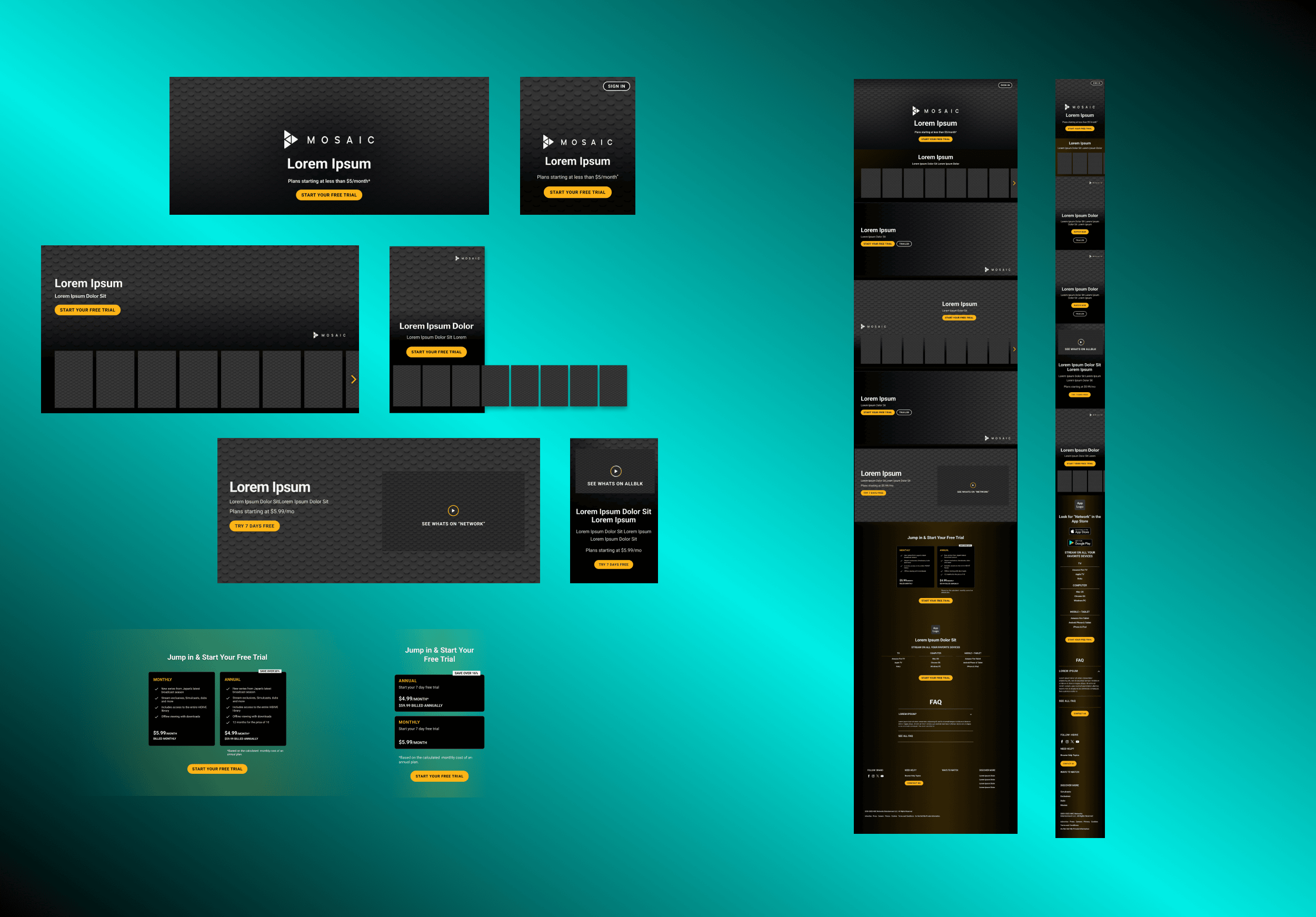
Design System
I started by building a responsive design system with reusable components that could be repurposed for any brand and any use case within the landing page ecosystem. This would lend it self to not only brand and content versatility but also quick and clean development.


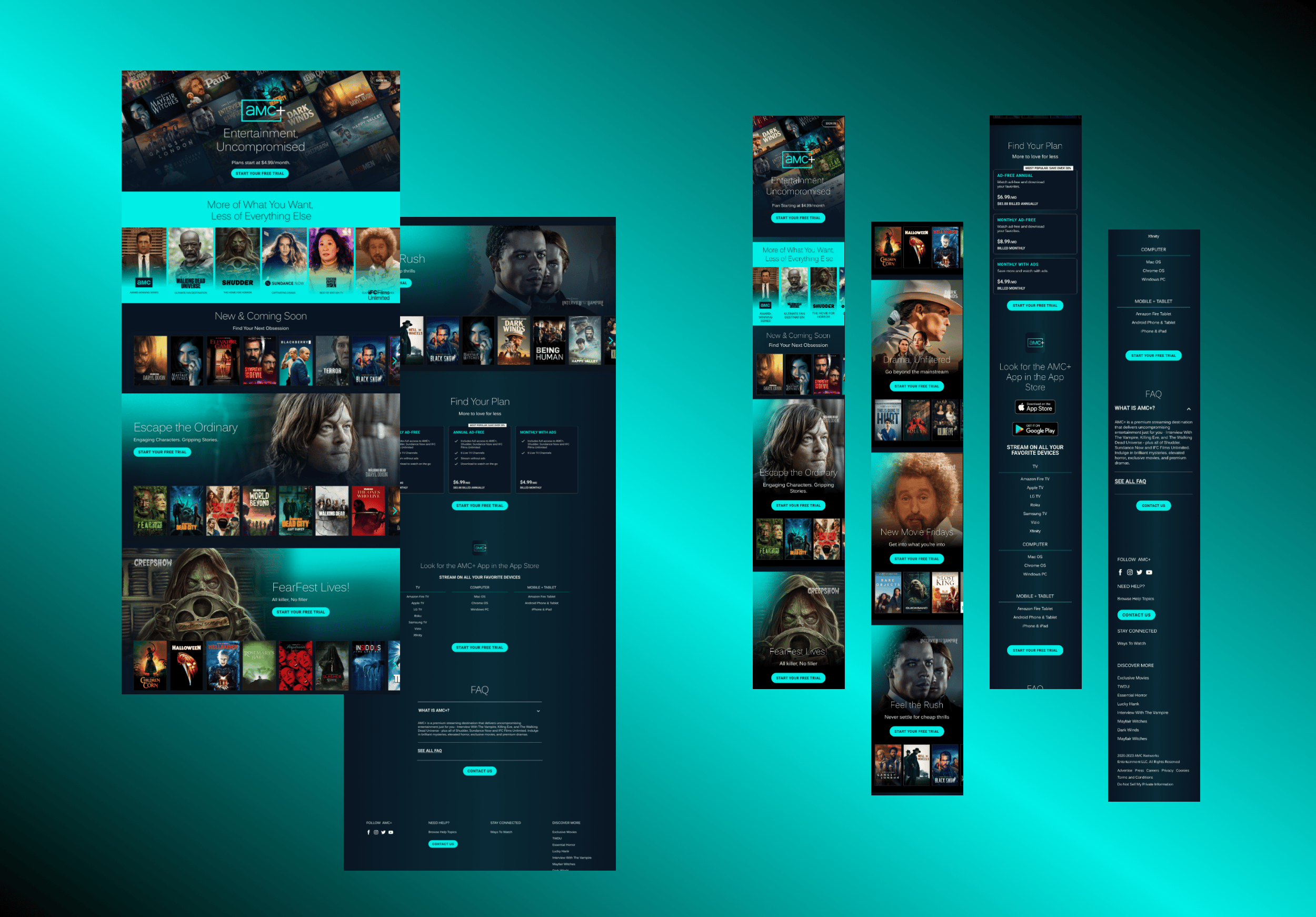
AMC Plus
Next I worked closely with the creative and marketing teams to develop a more inviting brand expression for AMC+. Leveraging newly designed components, we highlighted a broader range of content available on the platform. Additionally, we ensured that pricing information was prominently displayed and incorporated clear CTAs at every scroll point to seamlessly guide users into the purchase flow.
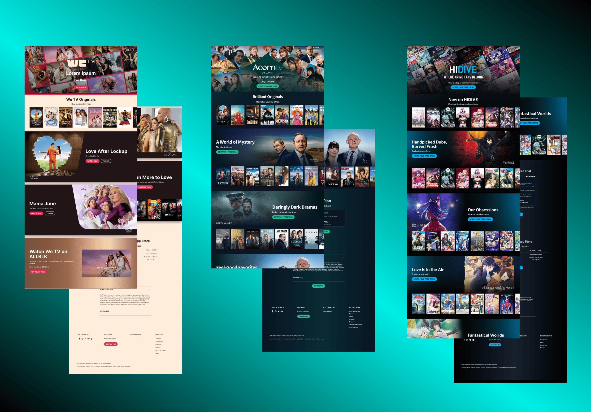
Versatility
Next, I shifted focus to other brands, reusing the components but tailoring them to align with differing brand strategies. For instance, for WETV was more single title specific, utilizing single-title cards and a video player card with CTA to introduce and guide users into new shows. In contrast, Acorn TV adopted a strategy similar to AMC+, showcasing a broad range of content to engage a wider audience.
